


Do you know the inevitable fact about prevalence of sexual harassment is because of low incidence of reporting? If victims don’t report about the harassment they have experienced then how would authorities be able to guide people from getting harassed and how would there can be a change in the offenders behaviours. Assorting and locating Varied Forms of Sexual Harassment case study helps victims to express their experience in anonymous manner and helps in categorizing various types of sexual harassment, victims have experienced, so that it helps in fast evaluation of category for filing testimonials and this also helps in providing safety precautions by taking into account of the analysis from the already filed forums. These safety precautions gives heads up for the individual by providing prevalent locations with most types of sexual harassments filed in that region and behavior of offenders. In future from the above predictions individuals will benefit a lot as they provide insights and creates awareness about the circumstances of the event.
Table of Contents
- Business Problem
- Business constraints
- Data Set Description
- Performance metric
- Preprocessing
- Exploratory Data Analysis
- Machine Learning Model
- Deep Learning Model
- Deployment of DL model 10.Future Work
- References
1. Business problem
Here victims stories are categorized into three types of sexual harassment i.e., we convert into multi label classification as the victims can face one or more types of sexual harassment at the time.
2. Business constraints
As my case study is a multi-label classification, a misclassification is no longer a hard wrong or right. A prediction containing a subset of the actual classes should be considered better than a prediction that contains none of them i.e. predicting two of the three labels correctly is better than predicting no labels at all. We don’t have any strict latency concerns. Interpretability is very important because it helps in finding why the story is classified as one of the type of harassment
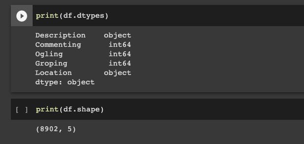
3. Data Set Description
Data has been collected from safecity online forum and WIN World Survey (WWS) a market research and polling survey for collecting data of sexual harassment predominant countries
Data set contains two features. Feature 1 — contains victims stories (Description) , Feature 2 contains Geolocation (Location) of the event taken place.
Our class label is multi label classification which contains three types of sexual harassments (Commenting, Ogling and Groping) victim has experienced.
4. Performance Metric
For multi label classification predictions for an instance is a set of labels and therefore , our predictions can be fully correct , partially correct or fully incorrect. This makes evaluation of a multi label classifier more challenging than evaluation of a single label classifier. However for the evaluation of partial correctness we can use below metrics for evaluation.
Accuracy — Here accuracy for one instance is calculated as the proportion of the predicted correct labels to the total number(predicted and actual ) of labels. Overall accuracy can be obtained by the average across all instances.
These metrics can be computed on individual class labels and then averaged over all classes. This is termed as Macro Averaging. Alternatively, we can compute these metrics globally over all instances and all class labels. This is termed as Micro averaging.
We use Macro F1-score and Micro F1-score as metric for multi label classification.
Hamming Loss is used as metric for multi label classification , this metric computes the proportion of incorrectly predicted labels to the total number of labels.
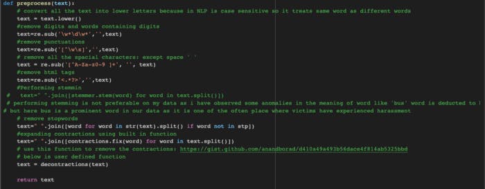
5. Preprocessing
In order to obtain better insights we head for cleaning of our data (like removing symbols, punctuations, special characters etc.). When it comes to text data, cleaning or preprocessing is as important as model building.
Below are the preprocessing steps we need to perform:
- Lower casing
- Removal of digits
- Removal of punctuations
- Removal of special characters
- Removal of html tags
- Removal of stop words
- Expanding contractions
6. Exploratory Data Analysis
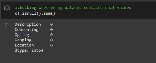
It is important to ensure that the data is ready for modelling work. Exploratory Data Analysis (EDA) ensures the readiness of the data for Machine Learning. In fact, EDA ensures that the data is more usable. Without a proper EDA, Machine Learning work suffer from accuracy issues and many times, the algorithms won’t work. EDA helps us to understand the data and get better insights. So we head for the EDA.
Checking Null values in the dataset
We add an extra feature to the data frame which calculates the number of words from a victim story.
Plotting distribution plot by taking into account of word count column from our data frame
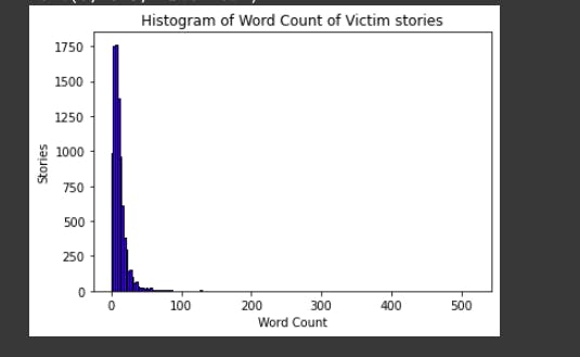
From the above plot we can deduce that most of the victim prefer sharing their experiences within 100 words
Geographical plot
From our data frame we take into consideration of Location column and then calculate number of times for which victims have experienced harassment in a particular region. For plotting geographical plot we Construct data frame of countries(sexual harassment experienced region) and count of victims who have reported from that particular region
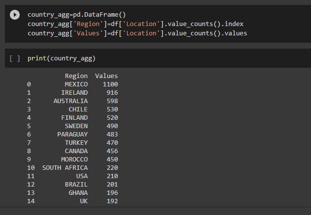
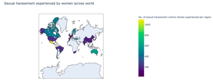
From the above graph we can deduce that highest number of victims are experienced in Mexico region(brighter yellow region)
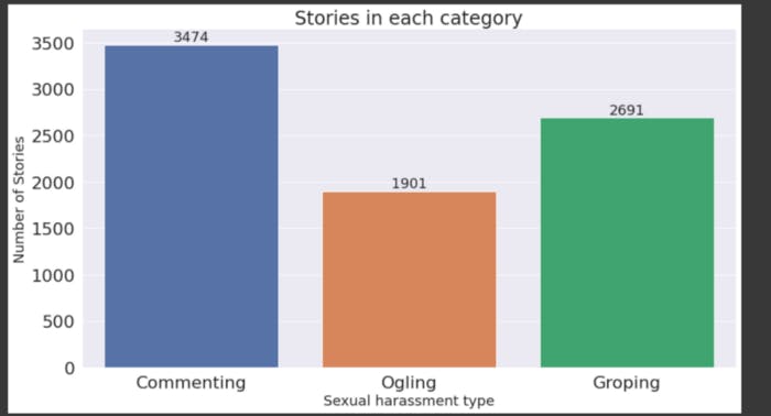
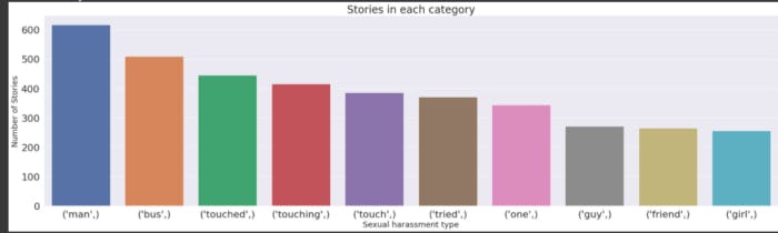
Bar Plot
Bar plots to check number of victim stories in each category
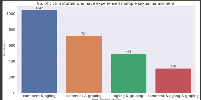
We are creating a column ‘label’ as follows:
→ we label 1 when the person experiences only commenting harassment
→we label 2 when the person experiences only ogling harassment
→we label 3 when the person experiences only groping harassment
→we label 4 when the person experiences only commenting and ogling harassment
→we label 5 when the person experiences only ogling and groping harassment
→we label 6 when the person experiences only commenting and groping harassment
→we label 7 when the person doesn’t experience any harassment
→we label 8 when the person experiences three types of harassment at the same type
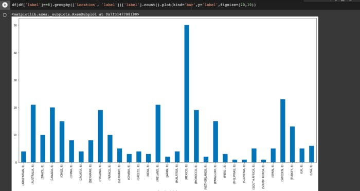
From above bar plot we can observe that Mexico women have experienced highest sexual harassments.
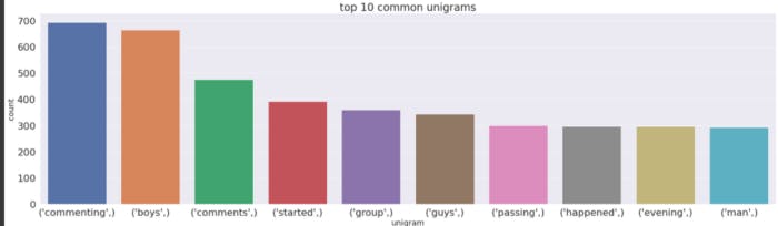
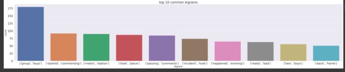
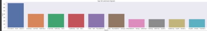
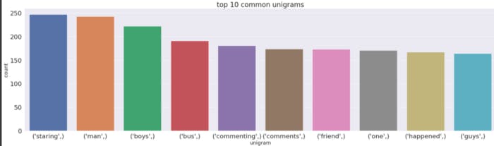
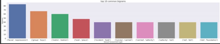
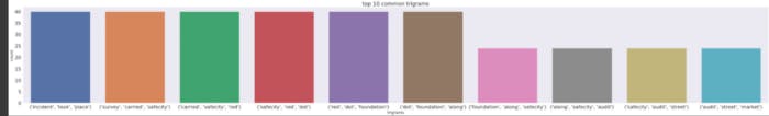
We also need to get clear intuition of the words that are frequently occurred in each category
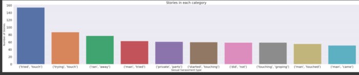
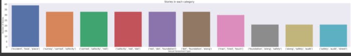
Below are the barplots of most common unigrams,bigrams and trigrams for each category
Under Commenting category
Under Ogling category
Under Groping category
TSNE
Performing vectorization on our victim stories in order to perform dimensionality reduction for the easy visualization of harassment category
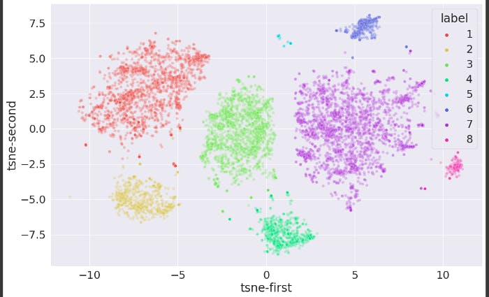
As we know TSNE is stochastic in nature so for multiple runs we get different visualizations , so I have run multiple perplexities and iterations in order to obtain above plot, this plot clearly indicates one class can be segregated from each other.
WORD CLOUD
We have also implemented word cloud for the visualization of frequent data in each category.
Under Commenting category
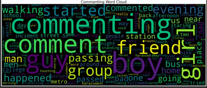
From above we can deduce that for comment sexual harassment type most of the offenders were boys for this type event has usually taken place at college , station , bus, school
Under Ogling category
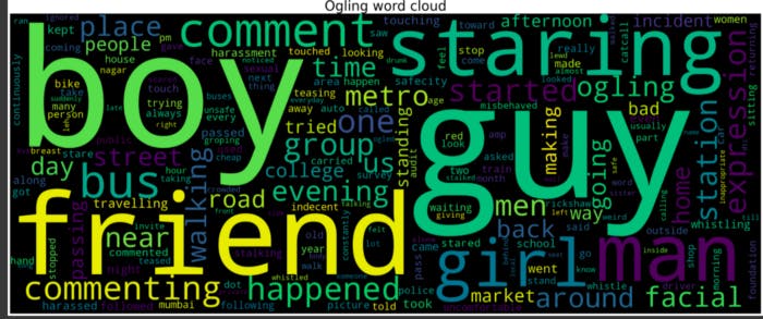
From above we can deduce that for ogling sexual harassment type most of the offenders were guys for this type event has usually taken place on the streets while the victims were walking , passing by , going to college
Under Groping category
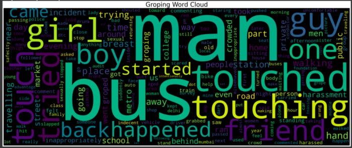
From above we can deduce that for groping sexual harassment type most of the offenders were man for this type event has usually taken place in public places like at bus , station while they were traveling where people are crowded
Scatter text
Using scatter text for visualizing unique terms and their frequency
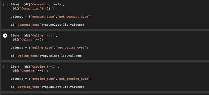
Scatter text plot works on categorical data as a binary classifier so we are creating separating columns for each harassment type with categorical values
Scatter text plot for commenting category
From above figure we can deduce top commenting words and non commenting words. The top-right of the chart are the most-shared terms and the bottom-left are the least frequent of the most-shared terms.
Scatter text plot for Ogling category
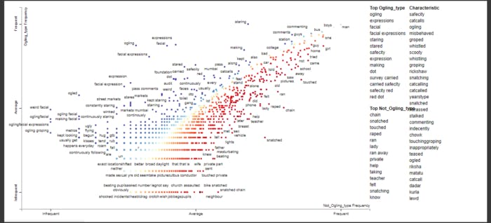
From above figure we can deduce top ogling words and non ogling words. The top-right of the chart are the most-shared terms and the bottom-left are the least frequent of the most-shared terms.
Scatter text plot for Groping category
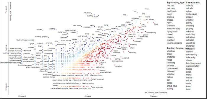
From above figure we can deduce top groping words and non groping words. The top-right of the chart are the most-shared terms and the bottom-left are the least frequent of the most-shared terms.
7. Machine Learning models
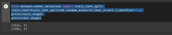
For training the model we did a basic train test split and tried various models
We have performed various machine learning models using BOW, TFIDF , GLOVE 300 dimension and we have observed below values for respective metrics.
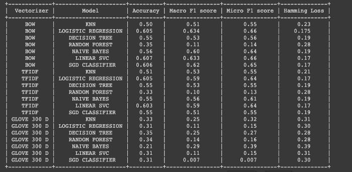
From the above we can deduce high Macro F1 score of 0.63 from Linear SVC using BOW vectorizer, moreover BOW and TFIDF vectorizer outperforms GLOVE vectorizers in each metric.
We also head for the implementation of deep learning models.
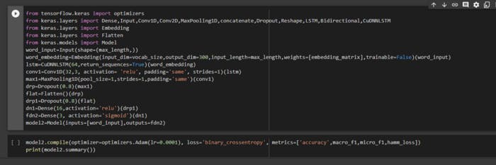
8. Deep Learning models
CNN Model
We have built a convolutional neural network by passing Glove 300 Dimensions into the embedding layer
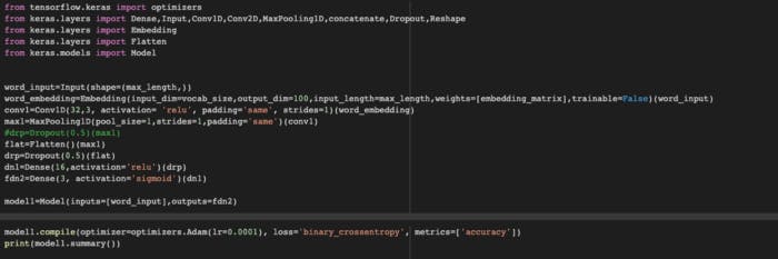
As we are working on multi label classification we pass our last layer into sigmoid activation and we implement binary cross entropy loss function.
CNN-LSTM Model
We have also built a convolutional neural network by passing Glove 300 Dimensions into the embedding layer and then also added LSTM layer for the CNN-LSTM model.
Summary of both DL models
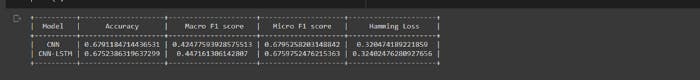
From the above metrics choosing CNN as best model
9. Deployment of model
I have created web app using Flask and deployed my best model

Below is the link of the demonstration of my deployed model. https://youtu.be/3QD45Gjk-H0
10. Future Work
→ We need to gather more data so that it helps us to improve values of our performance metrics on test data set.
→ We can try BERT embeddings and FastText word embeddings
→ We can work on our custom model in order to obtain enhanced values on performance metrics by changing architecture
You can find my complete code over here.
11. References
https://aclanthology.org/D18-1303.pdf
stackoverflow.com/questions/19790188/expand..
kdnuggets.com/2020/09/geographical-plots-py..
towardsdatascience.com/interpreting-scatter..
analyticsindiamag.com/visualizing-sentiment..
deveshsurve.medium.com/running-flask-app-wi..
Thank you for reading my blog.
Link to my GitHub Repo https://github.com/yashaswikakumanu/sexual-harassment